Denver, CO / Church rebrand
Victory Church
A familiar V. A fresh perspective.
A familiar V.
A fresh perspective.
Slide to see the transformation—from the original identity to a bold mark rooted in the Rockies.
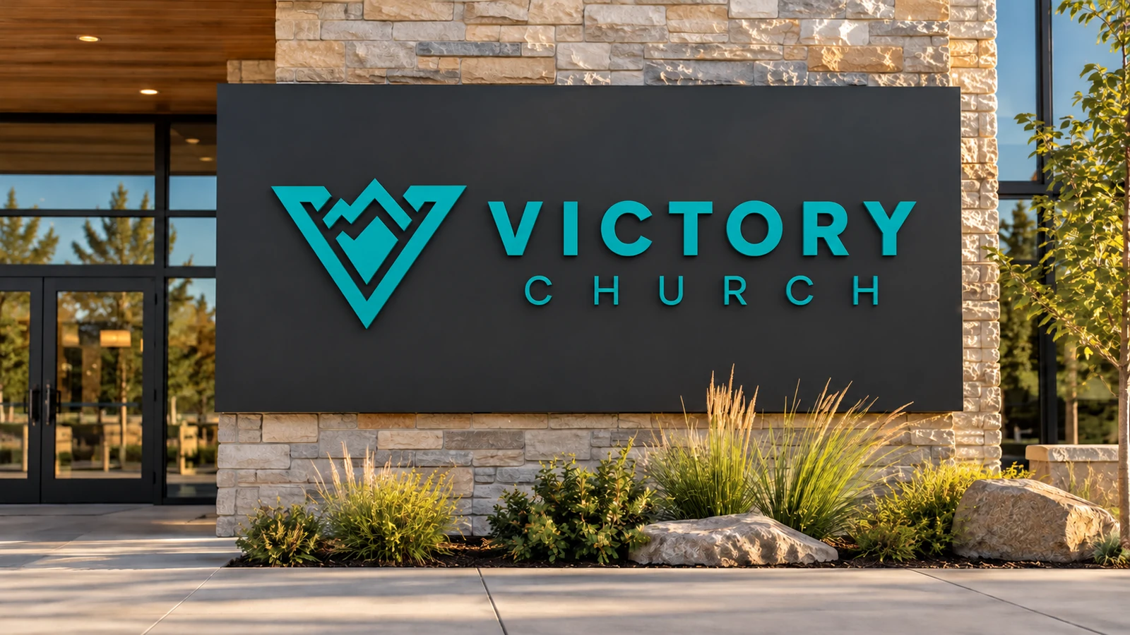
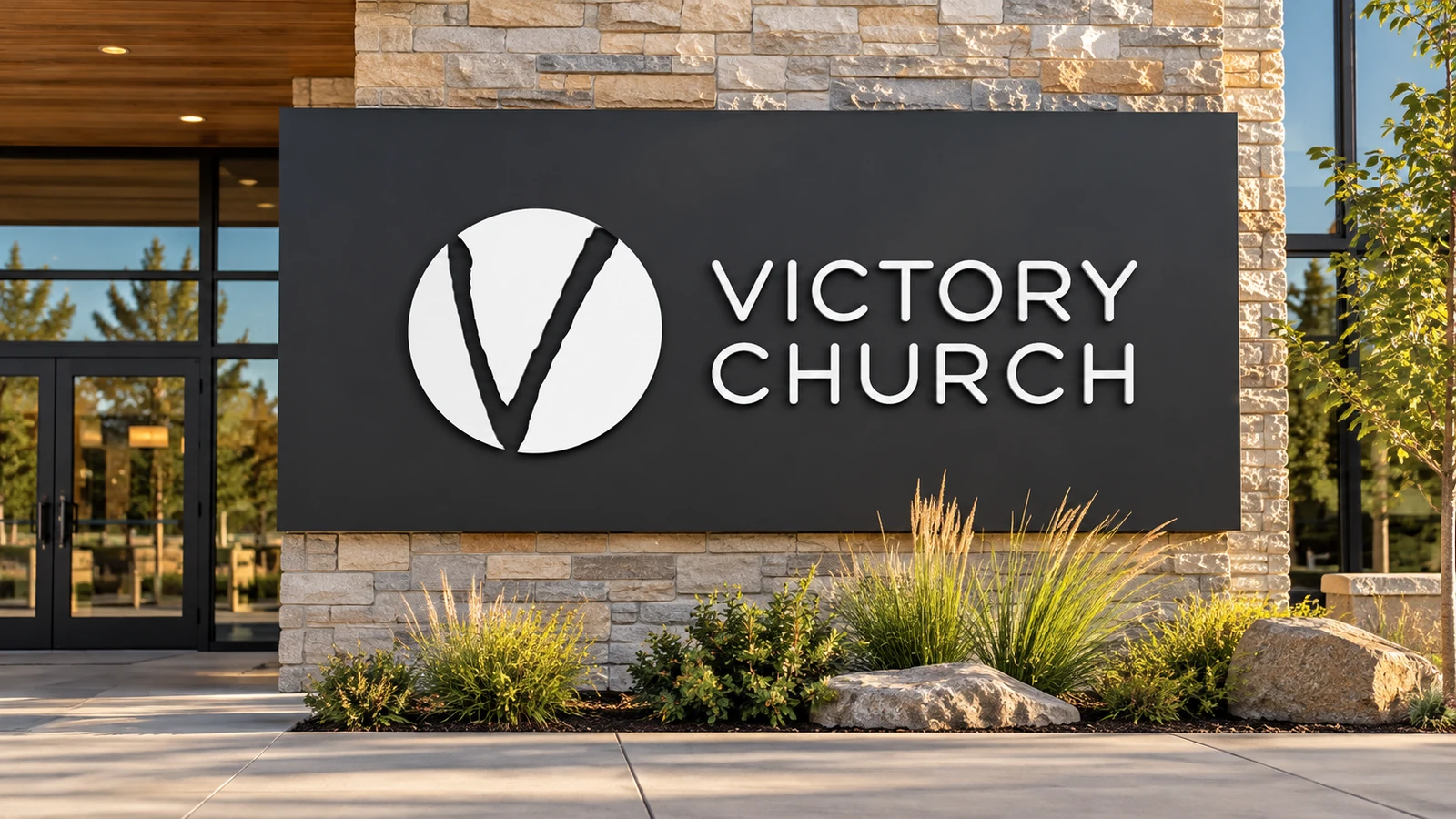 BEFOREAFTER
AI-created signage mockups illustrate the identity transformation.
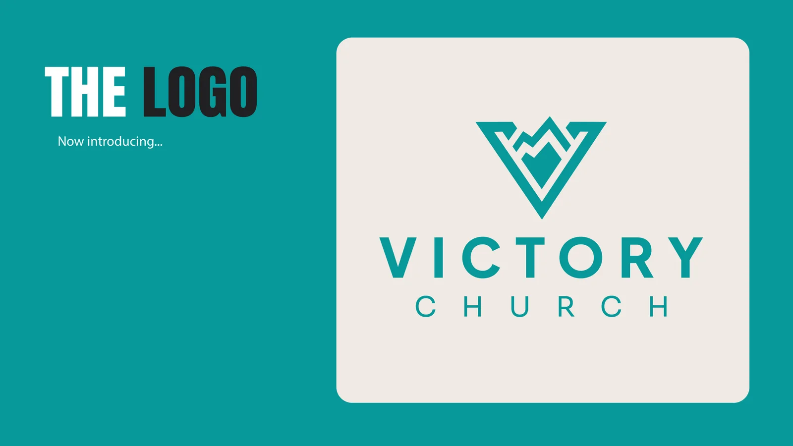
A VISION MADE VISIBLE
A familiar V. A fresh perspective.

The starting point
Victory Church in Denver had used the same V-shaped logo with Papyrus typography for many years. It served the church for decades, but the team was ready for a fresh rebrand designed to last for years to come.
The discovery
Working with Pastor Jonathan and the creative team was an honor. We explored a variety of concepts and ideas, with the nearby Rocky Mountains becoming an important reference. The mountain imagery needed to feel clear and simple, without becoming overly detailed.
The direction
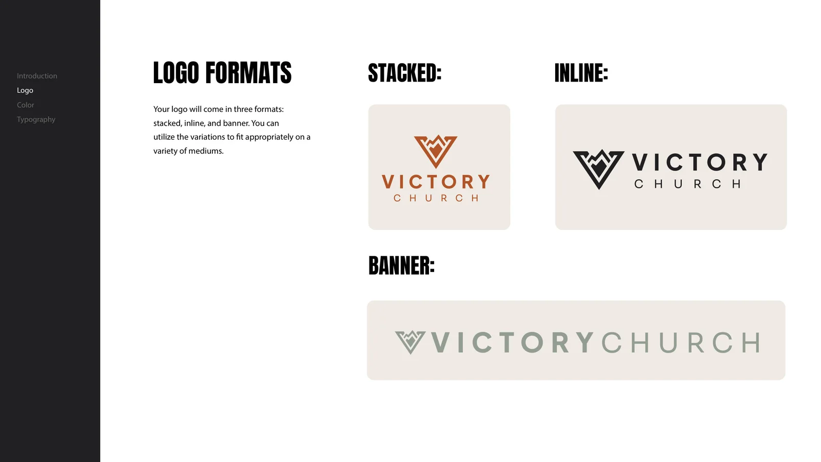
As we worked through mountain-inspired icons, we recognized that moving too far from the original V could make the new identity harder for the congregation to embrace. The final mark combines that familiar V with bold, simplified mountain shapes.
The identity
The result is a distinctive mark that resonated with their people, designed to become a lasting staple in the community.
THE VISUAL IDENTITY
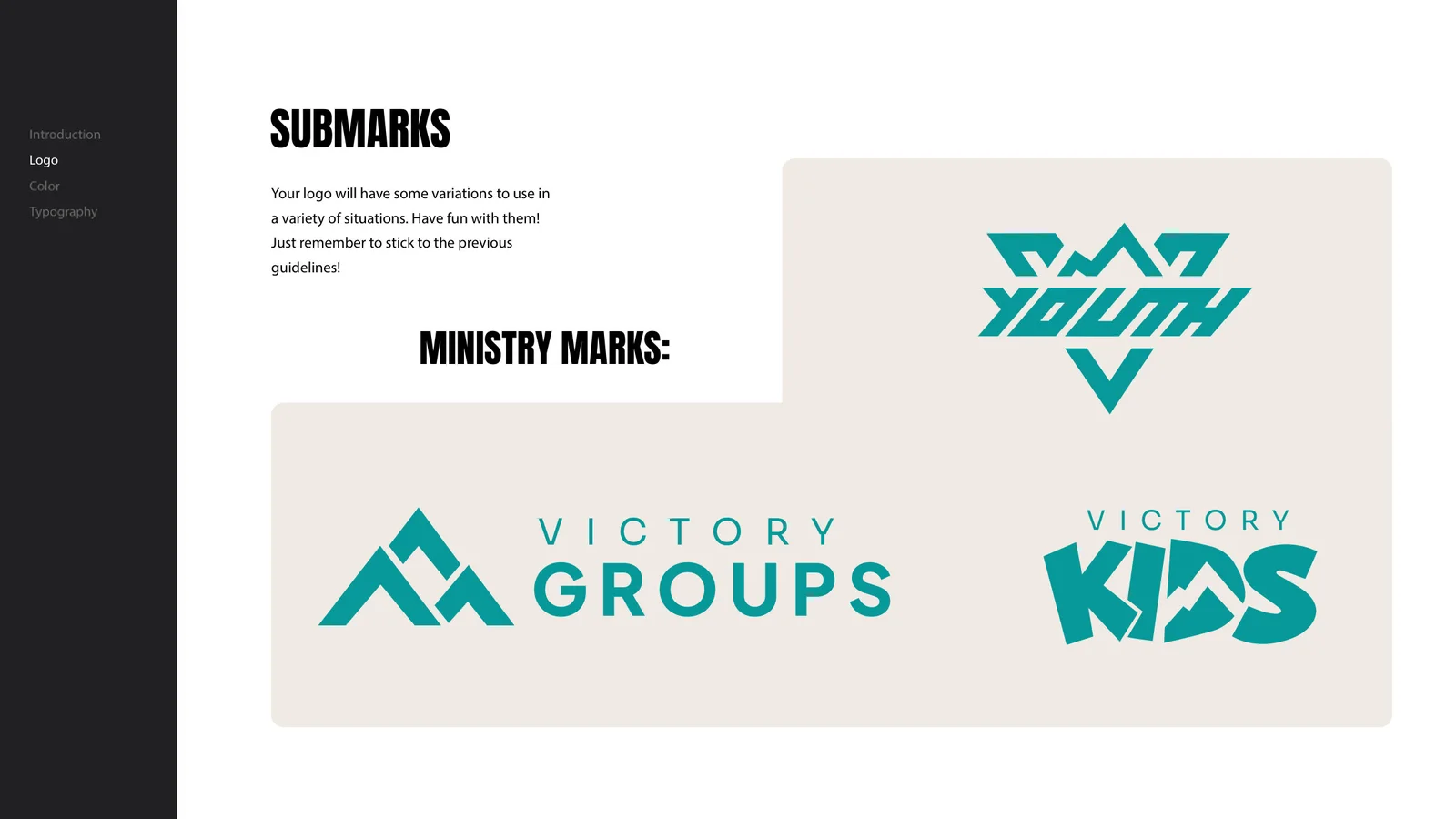
The mark.
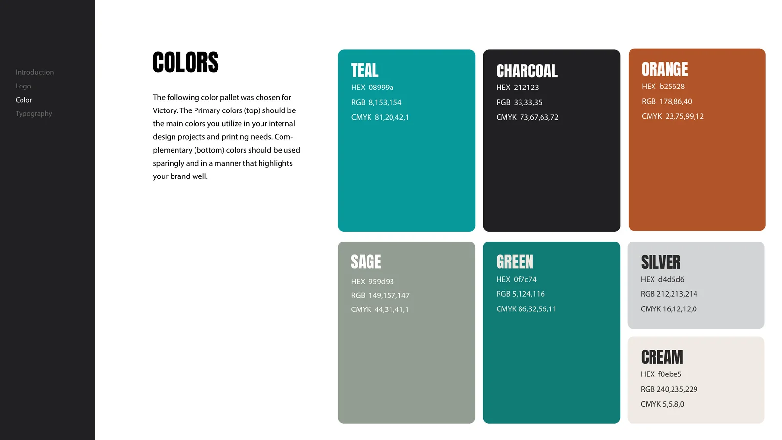
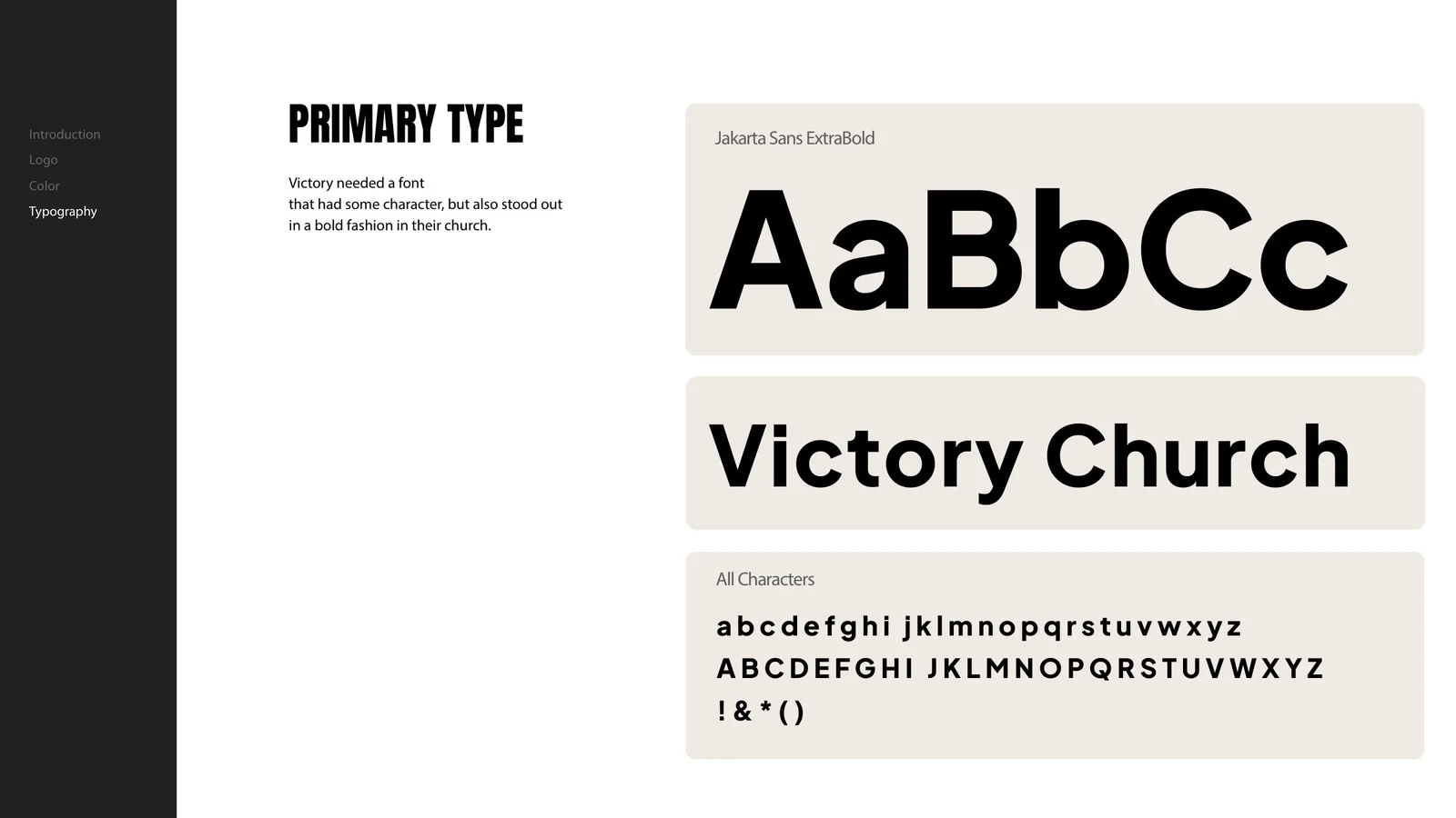
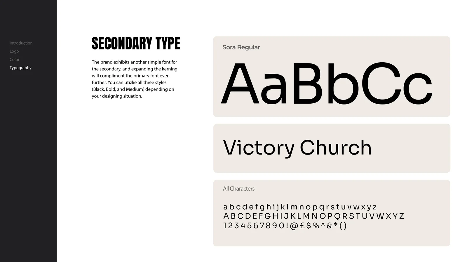
The whole system.
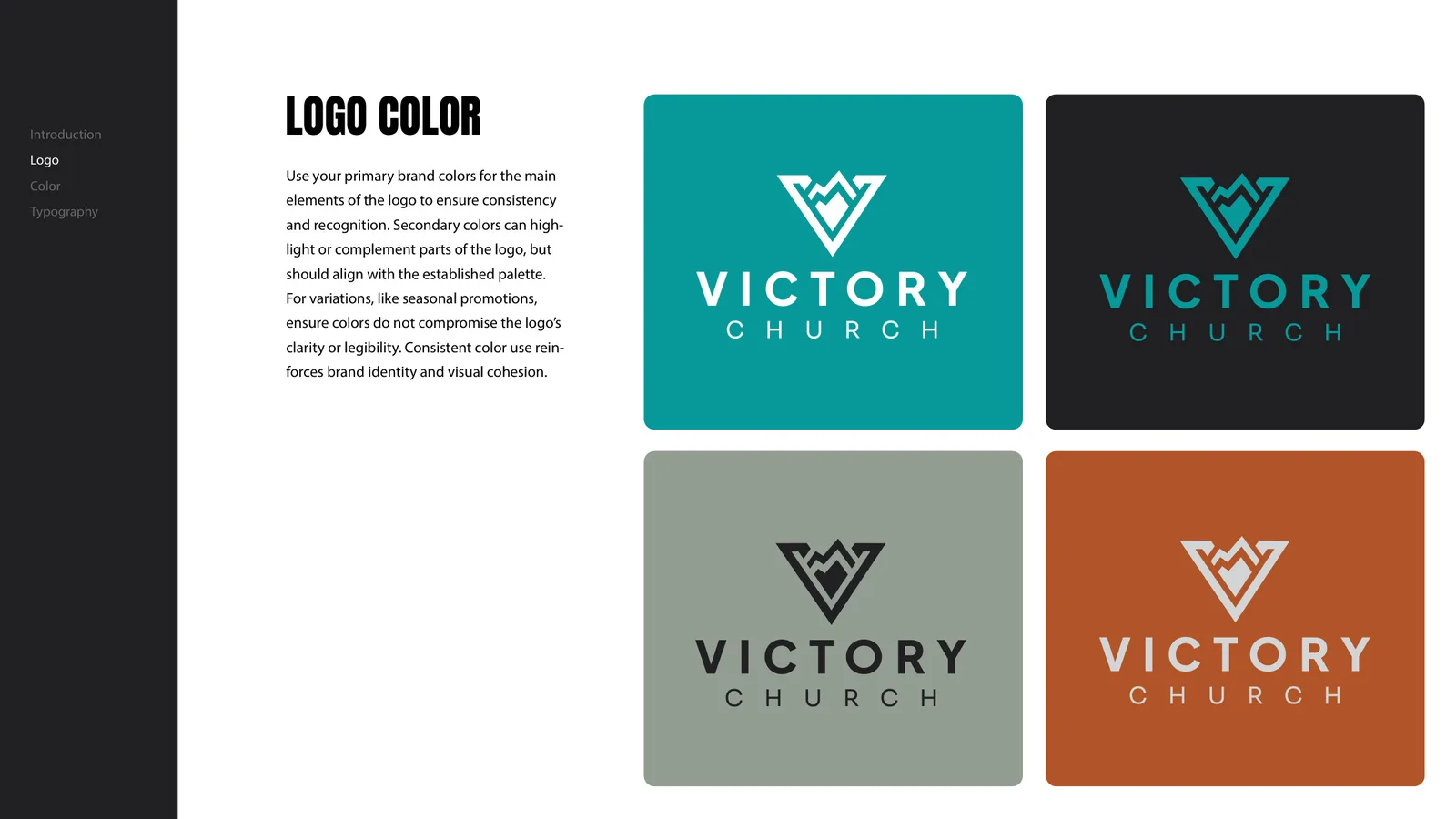
IDENTITY IN CONTEXT
From mark to
every touchpoint.
Hover or tap a mockup to explore.
Visual mockups show the identity across signage, apparel, print, and digital applications.
KEEP EXPLORING
City Hill Church
Eden Prairie, MN
YOUR STORY COULD BE NEXT
BRANDS THAT
MAKE JESUS
KNOWN.
A visual identity that feels like your church and connects with your community.Explore Church Branding Explore Church Graphics Let’s create together